
I chose to annotate this front cover of NME because Rihanna is a well-known pop singer, and therefore it fits in with the genre for the magazine I would like to do NME is also a very popular music magazine The magazine cover for NME uses a medium shot for the front cover photo Its main focus is the eyes as it's on the top third section which her eye make-up reflects on the house colour of purple, black and blue The purple is a bright-bold colour which you can easily see over the artist which promotes the big names such as the singer itself 'Rihanna' and the magazine masthead of 'NME' which makes it stand out The blue contrasts with the black and purple which is eye-catching The blue is used on the props and costume such as the blue bird on her right shoulder and her blue trousers Therefore, when I come to do my own magazine I will use a dull and a bright colour so it doesn't look over the top and clashy The text is limited with it being mainly on the left hand side for when it is on the shelf if magazine is put side ays) so the key information is always shown It lists all the big artists in black capital letters It mainly includes: masthead, strap-lines, cover photo, pull quotes and puffs There is also a bar code and price in he bottom right-hand corner which is positioned across nearly all magazines in a small font so that the price does not put off the buyer so the rest of then contents on the front cover is bigger text The date of this magazine is above The date of this magazine is above the masthead in the top-left hand corner in small font so it is does nor detract attention from the cover photo
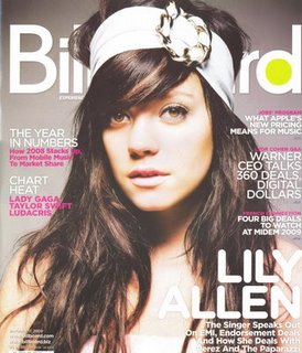
I chose to analyse this front cover of Billboard magazine because Lily Allen is a well-known pop singer and therefore it fits in with the genre of POP my magazine is.
The colour scheme/ house style for this front cover is white, pink and grey which compliment each other well. The masthead for this magazine is bright and bold with a few block colours to make it stand out and more recognisable. However compared to other music magazines and masthead is partly covered by the artist Lily Allen suggesting that this is a well-known magazine as the more you cover up the more popular it is. This will be considered when creating my music magazine to knowing that I should leave more of the masthead showing as it wont be as well-known.
There are a lot of cover lines which makes the front cover look more full, especially on the right hand side. This includes: cover photo, masthead, rule of thirds, strap line, house style, sell line, cover story and range of fonts (sanserif / serif)

You need to sort out the presentation of this post.It should look the same as your other posts.
ReplyDeleteMiss King
read and updated. Laura.
ReplyDelete